The Grid makes elements in the frame or on a page appear more organized. Grid layouts can make all the UI elements like navigation bars, text boxes, etc. set in an organized way.
They add asymmetry to the page and drives user attention. If you are unambiguous with your plan to accomplish the visuals in the right way, grids are perfect.
Grid layouts, overlapping, and asymmetry can bring extravagance to any content on the page. Let us take a quick tour to understand more about grids, elements, and layouts.
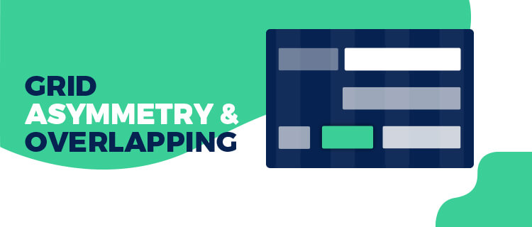
Broken Grid and Asymmetrical Layouts:
In technical terms, a grid is a cross-section of horizontal and vertical lines in an imaginary plane. It helps to project the layout and UI elements on a screen or page.
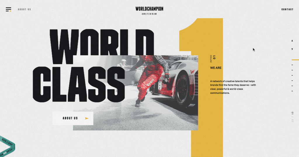
In a broken grid layout, the items are pushed around in a way that makes the grid appear broken or less rigid. The Broken grid and asymmetrical layouts are techniques that help you steal the show.
Designers can experiment with it to attract attention and engage users. In 2019, this combination is about to create a statement already.
1. CSS Grid:
Flexbox is like a fabled holy grail for many web developers and designers. It can make complex layouts easier to implement.
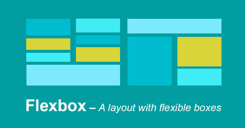
CSS Grids can let you place an item wherever you wish to put them. Place your elements horizontally or vertically wherever you feel it right. It helps you create alluring designs and unlocks a new level to express freedom.
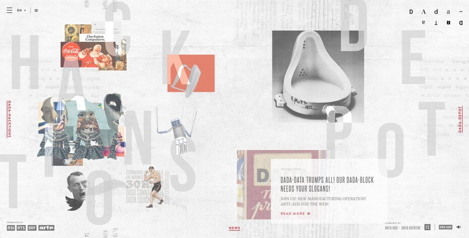
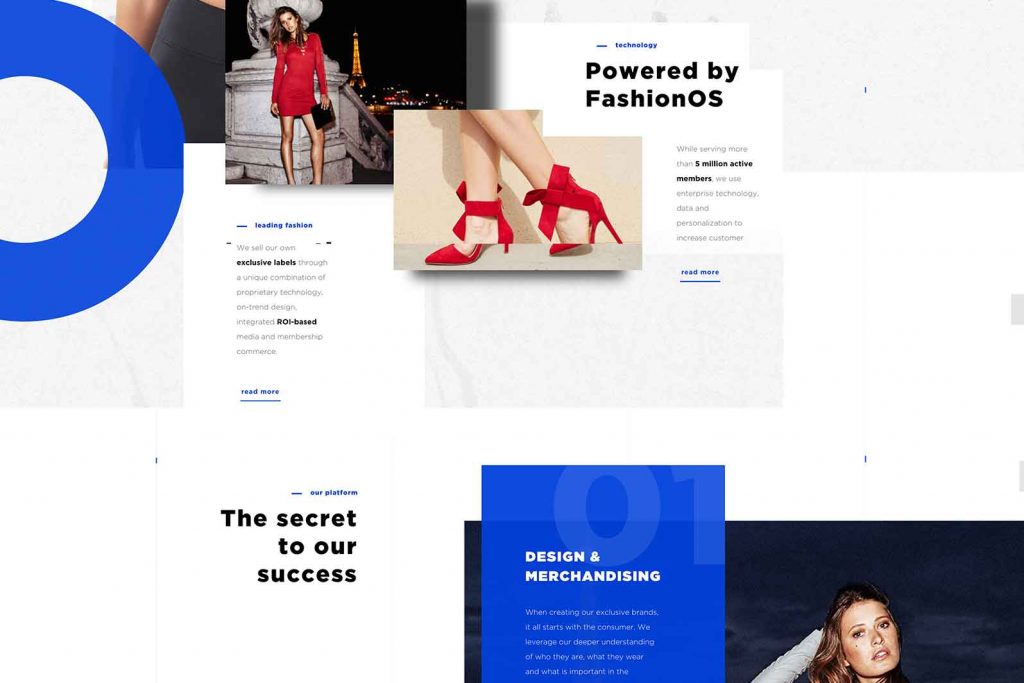
2. Broken Grid & Overlapping Elements:
Overlapping elements have been in the trend from the past couple of years. They create a unique layout when combined with broken grids.
But one must take care when working with mobile devices and responsive designs.
3. Asymmetry:
People have a misconception about asymmetry designs and layouts. But designers are thoughtfully working on breaking the stereotypes and setting the trend in 2019.
Asymmetry is so much more than just appearance. Here, the layering of various textures, colors, and patterns and some unusual placements sets these designs apart from the grid-based ones.
The asymmetrical designs are striking and encaptivating. They engage users letting them focus on the essential sections of the site.
4. Fluid, Geometrical & Asymmetrical Shapes:
We have seen fluid shapes in the past years, and they are here to stay and trend in 2019 too. The geometrical and fluid shapes can be mixed with vivid colors and bold gradients.
Go with the trend to weave magic in the web designs.
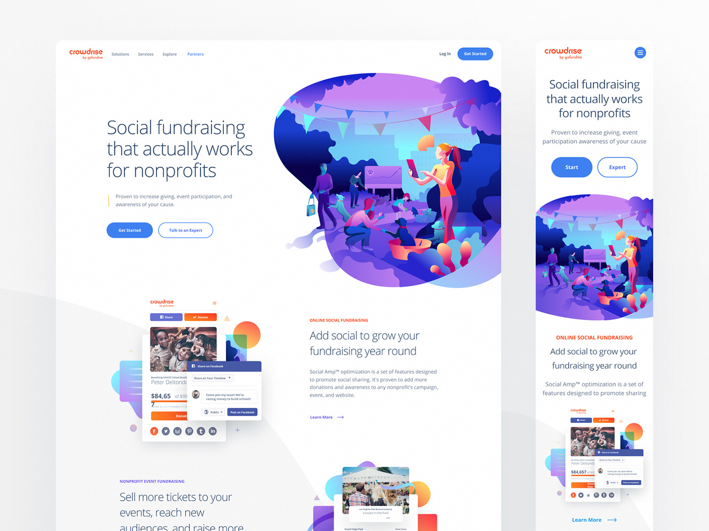
5. Overlapping Design Elements:
Items or elements overlapping each other can bring a visual treat to the users when viewing the page content. The trend of overlapping design elements can enhance the overall aesthetic of any site.
But designers should experiment and use these elements with careful consideration. Otherwise, it can mess up the elements on the page or frame. It can also create confusion among users.
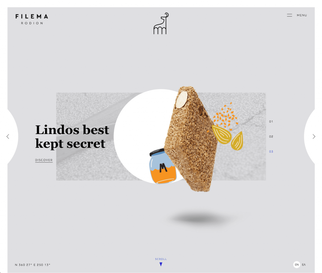
The most challenging part with overlapping elements is fitting them in responsive designs. But the right use of these elements can give a 3D look and make your designs stand out.