50 milliseconds: That’s all it takes for visitors to form an opinion about your website if this study is to be believed. In other words, a poor and ill-conceived website design can cost you potential customers and lead to lower conversion rates.
So, in this blog, we will look at the top web design mistakes to avoid like the plague, along with real-life examples of what works and what doesn’t. Are you pumped? Let’s get the ball rolling.
Top 9 Mistakes That Lead to Poor Conversion Rates
1. The Fine Line Between “Modern” and “Antique” Web Design
As with all things, visual and aesthetic, an antiquated and outdated design belongs in the Stone Age. In short, websites need to keep up with the latest content and design trends to stay relevant in the changing times.
Let’s see what we mean by antiquated and modern web designs trends. Here is a car rental website that has very convenient navigation. So visitors aren’t left in a dark hole of the site trying to figure out how to search for what they want.
Example : Auto Rentals

Key takeaway: Staying current and modern in terms of web designing and font type can foster a positive first impression among visitors and ultimately, lower conversion rates for your website. Studies add credibility to this fact, saying that “First impressions are 94% design-related.”
2. Excessive Cluttered Layouts Lead to an Overwhelmed Customer

It doesn’t take a genius to understand that a cluttered and complex design can make it near-impossible for your visitors to absorb the intended marketing message and discourage them from browsing your site.
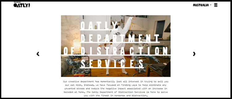
Needless to say, the use of multiple font colors, font types, headache-inducing images, and chaotic content doesn’t do anything for the website or the visitor. In stark contrast, take a look at a bird’s-eye view of Oatly’s web page layout:
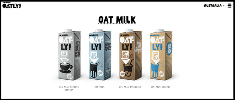
And here’s a seamless and simple layout for the product page with clean images and on-point content:
3. Unappealing CTA Buttons: A Major Buzz Kill
“Around 70% small business websites don’t have clear calls-to-action for anything on their homepages, such as specials, email newsletters, how-to guides, demos, and interactive tools.”
There’s no doubt that your website should have a strategically-placed call-to-action (CTA) button. After all, a CTA button is crucial in ensuring that your customers take the desired action and engage with the brand in an organic way.
Take a look at Asana’s website where the CTA button – Try for free – stands out and provides a clear direction for customers:
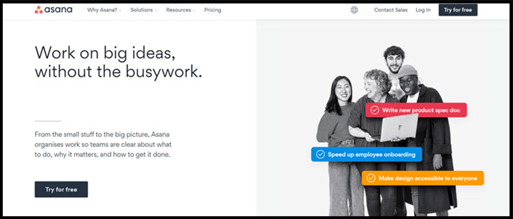
Handy tip: According to research by Nielsen Norman Group, there are two basic patterns in which people scan a page: the F pattern and the Z pattern. These can serve as a great starting point to understand where you can place the CTA.
In contrast, placing too many CTAs or having no CTA buttons can lead to confused and frustrated customers who may not understand how to connect with your brand:
4. Say Goodbye to Slow Page Loading Speeds

“39% of people will stop engaging with a website if images won’t load or take too long to load.” – Adobe
The wait-and-watch game surely doesn’t apply to the area of webpage loading. People expect a webpage to load in two seconds or less. This makes sense as human attention spans are at an all-time low or in exacting terms.
That’s not all. Further data claims that “Slow-loading websites cost retailers $2.6 billion in lost sales each year.”
In order to speed up page time, make sure to compress elements, optimize code, check server response times, minimize the use of videos and image sizes on the web portal.
Key takeaway: If experience is anything to go by, slow loading speed can kill conversions and cost millions in revenue due to increased user abandonment.
Here’s a handy tip: Use Google’s PageSpeed Insights to test your site’s speed and figure alternatives to speed up your page load time.
5. Non-Responsive Websites Birth Unimpressed Customers
In design terms, we call it website responsiveness which comes with legible, compelling, and easy to navigate content. With more than half of the world’s population now browsing on smartphones, it makes sense for companies to ensure that their website is multi-platform-friendly – from tabs and desktops to mobiles and laptops.
Gone are the days when pinching, zooming, scrolling, and doing everything in between to read website content was acceptable.
Here’s a snapshot of what a responsive and non-responsive website looks like:

Key takeaway: A responsive website design is Google-approved and frankly, critical to delivering seamless and optimal user experience.
6. Generic Stock Images Deliver Generic Results
According to research by Adobe, “Given 15 minutes to consume content, two-thirds of people would rather read something beautifully designed than something plain.”
In simpler terms, the era of visual marketing is upon us. In fact, users are obsessed with visual media and engage better with brands that share their stories via original infographics, images, videos, etc.
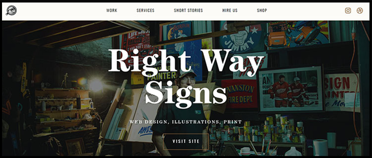
Refreshingly, here’s another website, the Forefathers Group, which uses illustrations and visuals in the right context and the right frequency:
Key takeaway: Care must be taken to avoid uploading low quality or generic images to reduce conversion rates.
7. The Lost World: Confusing and Improper Navigation
“It doesn’t matter how many times I have to click, as long as each click is a mindless, unambiguous choice.” – Steve Krug
The next element in the website marketing mix is navigation. A neatly structured website plays an important part in converting a visitor into a customer. Conversely, a poorly structured and multi-layered navigational flow can make you lose your customers.
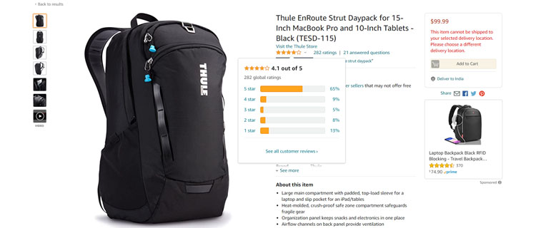
8. Lack of Social Proof Equals Zero Followers

This one’s a no-brainer. In today’s social media age, having no social proof means no credibility for the products and services you offer. By extension, reviews play an important role in the buyer’s mind and help build credibility and authority over the brand’s offerings:
Amazon’s website makes excellent use of customer reviews:
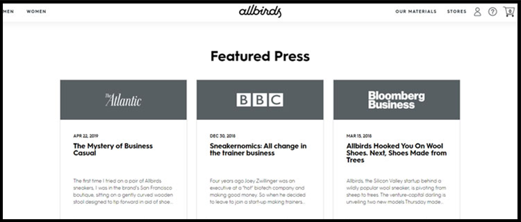
Another approach is to highlight the brand’s mention in various publications and focus on sustainable actions as Allbirds does, effectively might we add:
9. Say No to Poorly-Placed Banners at All Costs
Here’s an interesting fun fact: “You’re 279.64 times more likely to climb Mount Everest than click on a banner ad.”
All things said and done, poorly placed banners that pop out of everywhere should be…well, banned.
Stuffing your homepage with a large and infinite number of banners can make your website appear like a huge advertisement platform and prove to be a major turn off for visitors.
Wrapping Up
In the web designing universe, it is fair to assume that users will judge a book by its cover and by extension, the brand itself.
So make sure that your visitors experience your website from cover-to-cover (pun intended) and enjoy the platform with every click of a button.